
Fortune 50 · eCommerce · 2018–2019
The Home Depot
Redesigning paint color discovery — helping customers see their space before they paint it.
Confidential. Certain screens and details have been modified to protect proprietary information. Available in full under NDA — request access.
Overview
Paint is the highest-anxiety purchase in home improvement
The Home Depot is the world's largest home improvement retailer, with over 2,300 stores and 40 million monthly online visitors. Paint is one of their highest-volume categories — and one of the most return-prone.
Customers couldn't confidently choose a color online. The existing search, browse, and product detail pages gave them swatches — but no way to visualize how a color would actually look in their space. The result: high abandonment, high returns, and low digital-to-store conversion.
I was brought in to redesign the end-to-end paint color discovery experience — from search results through the product detail page — with a focus on confidence, comparison, and conversion.
Project details
The Challenge
Six problems that made paint the most returned product in the store
No visualization
Customers could see a swatch thumbnail but had no way to see how a color would look on their actual walls. The gap between swatch on screen and paint on wall was the #1 driver of returns.
Broken comparison
The compare feature existed but was buried, slow, and showed colors side-by-side without room context. Customers couldn't make a confident decision between two similar shades.
Fragmented discovery
Search, browse, and the color explorer were three separate experiences with different navigation patterns, filter systems, and visual languages. Customers got lost moving between them.
Sample friction
Ordering a paint sample — the highest-intent action short of buying a gallon — required too many steps and wasn't surfaced prominently enough on the PDP.
Mobile neglect
Over 60% of paint browsing happened on mobile, but the color explorer and compare tools were desktop-only. Mobile users hit dead ends at the most critical decision points.
Confidence gap
Even customers who found the right color weren't sure they'd made the right choice. There was no social proof, no room inspiration, and no guidance at the point of decision.
Approach
Three phases — discover, visualize, decide
Phase 01
Discover — redesigning search and browse
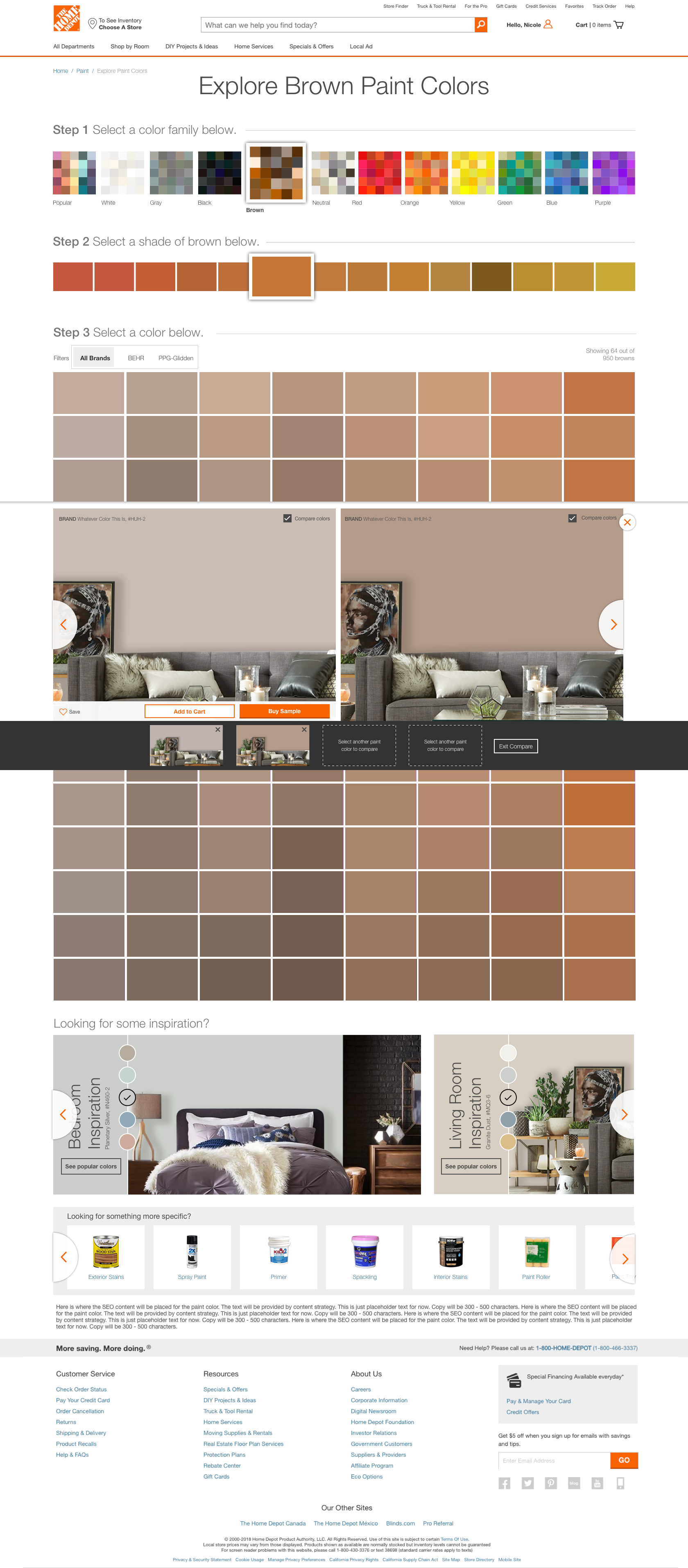
We audited the full search-to-PDP funnel with session recordings and exit surveys. The data showed customers were abandoning at two points: the search results page (too many undifferentiated swatches) and the color explorer (too many steps to get to a product). We redesigned both with richer color family navigation, smarter filtering, and a persistent selections bar that kept context as customers drilled down.
Faceted filter system with color family, sheen, brand, and container size
Persistent selection bar — no more losing context mid-browse
Sample CTA surfaced on every search result card
Mobile-first grid with touch-optimized swatch sizing
Phase 02
Visualize — the interactive color explorer
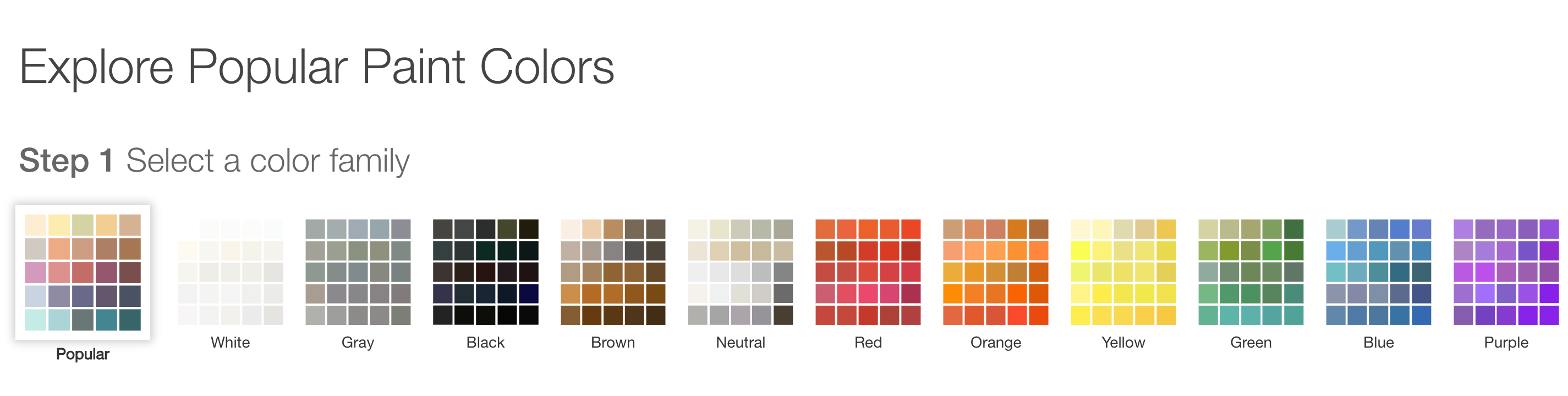
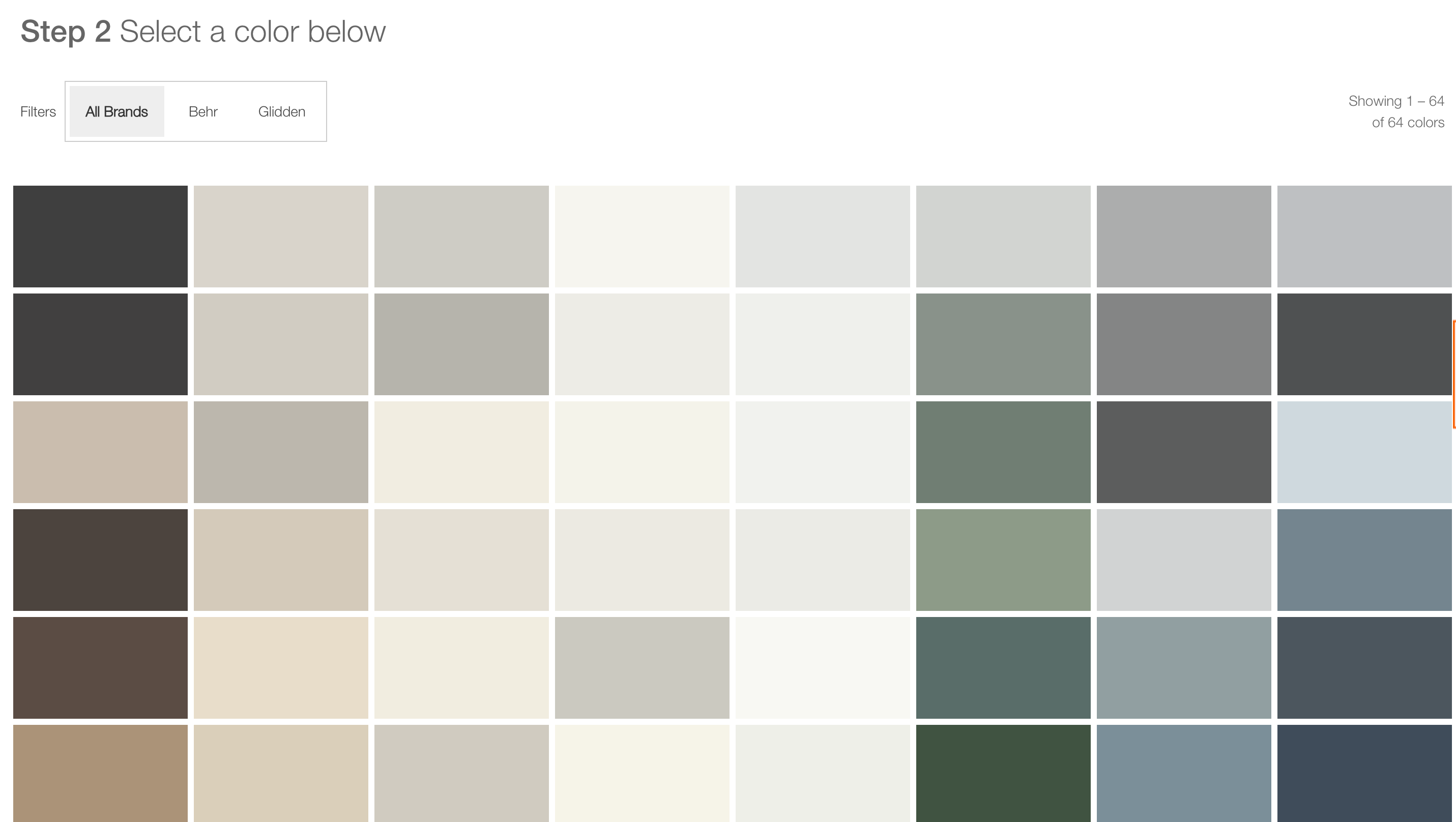
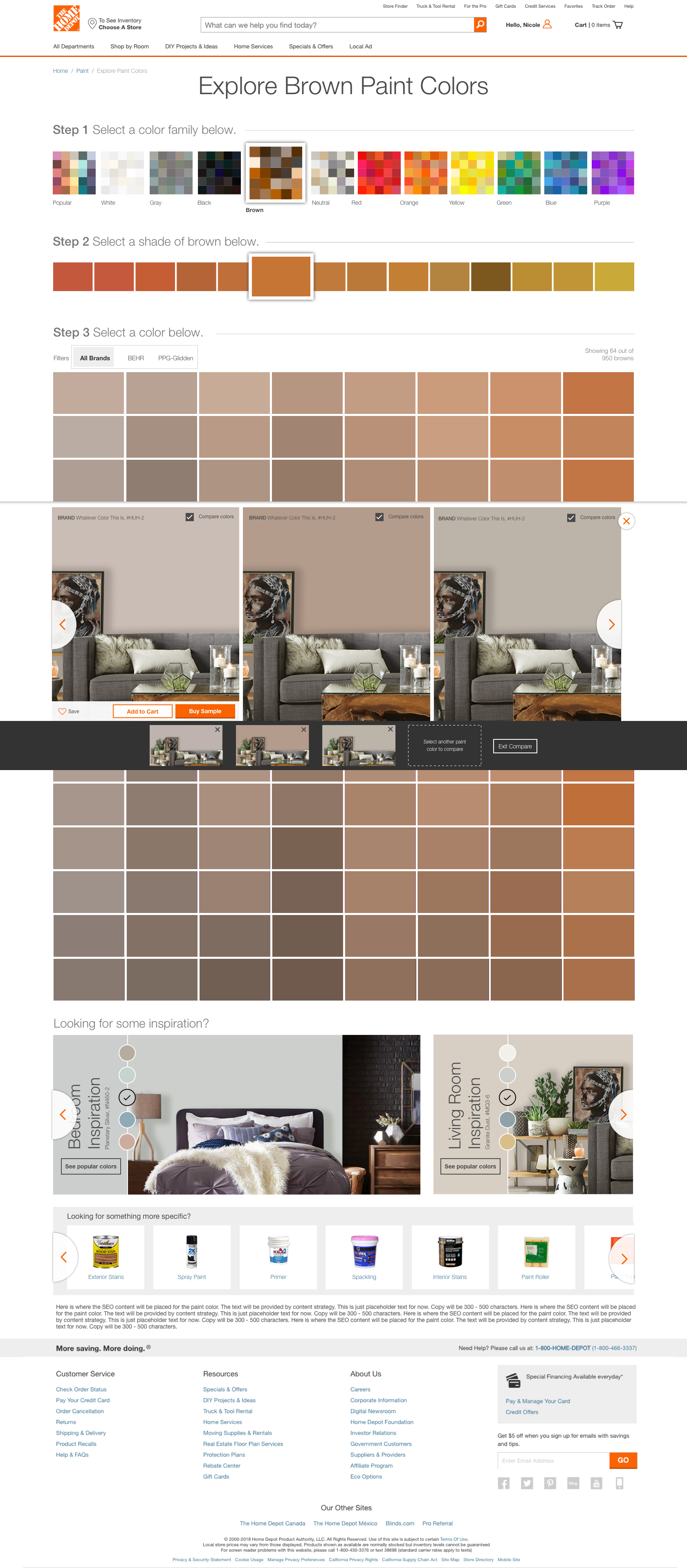
The color explorer was rebuilt as a three-step guided flow: pick a color family, pick a shade, pick a specific color. At each step, room visualization imagery updated in real time. The compare tool was promoted from a buried feature to a first-class interaction — customers could compare up to three colors side-by-side in a real room setting, not just as flat swatches.
3-step guided flow reduces decision paralysis
Real-time room visualization at every step
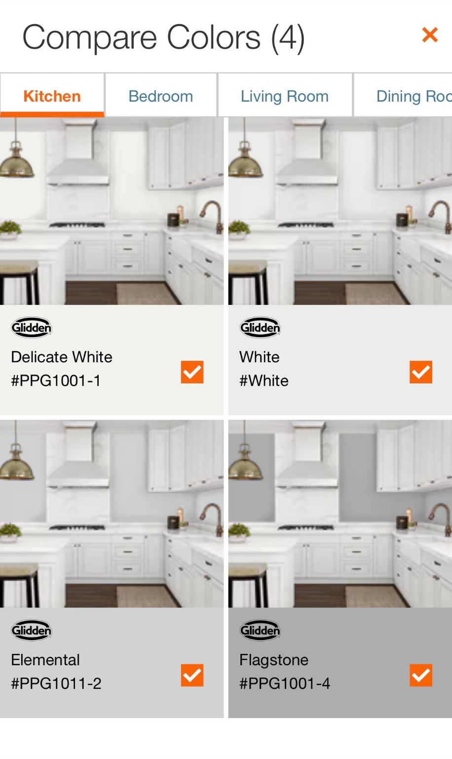
Compare up to 3 colors in a room setting
Inspiration galleries tied to color families
Phase 03
Decide — the redesigned product detail page
The PDP was the final conversion point. We restructured it around the customer's decision: lead with the color swatch and room photos, surface the sample CTA above the fold, and add a colors-that-go-with-this section to reduce trim anxiety. Specifications and technical details moved below the fold for the customers who needed them.
Color swatch and room photos lead the page
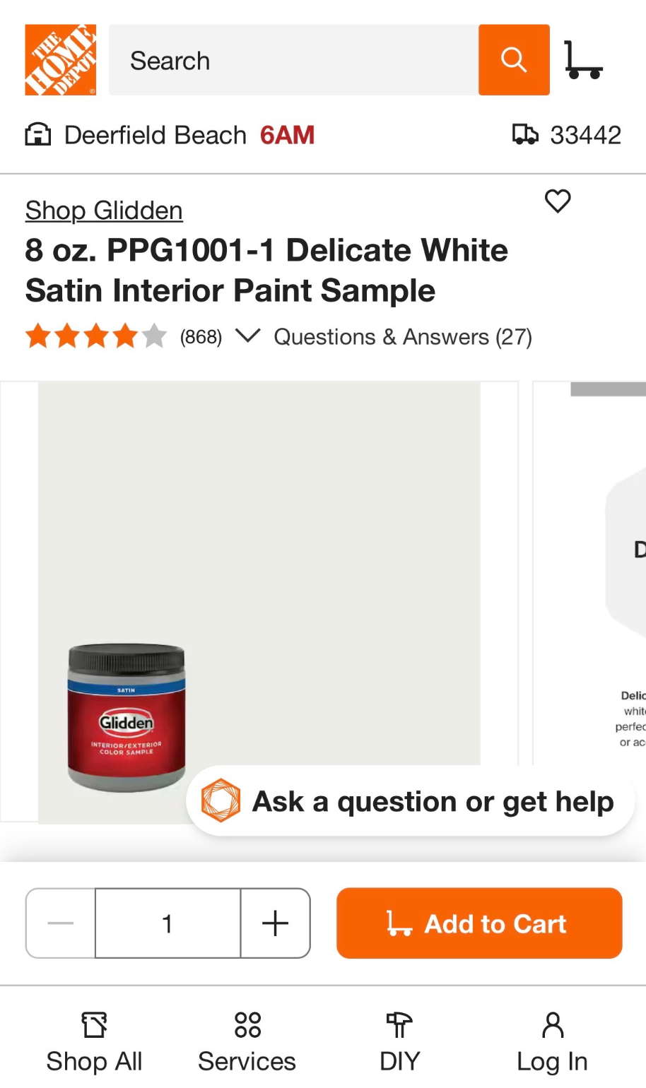
Sample CTA above the fold — $3 commitment, not $40
Colors that go with this section reduces trim anxiety
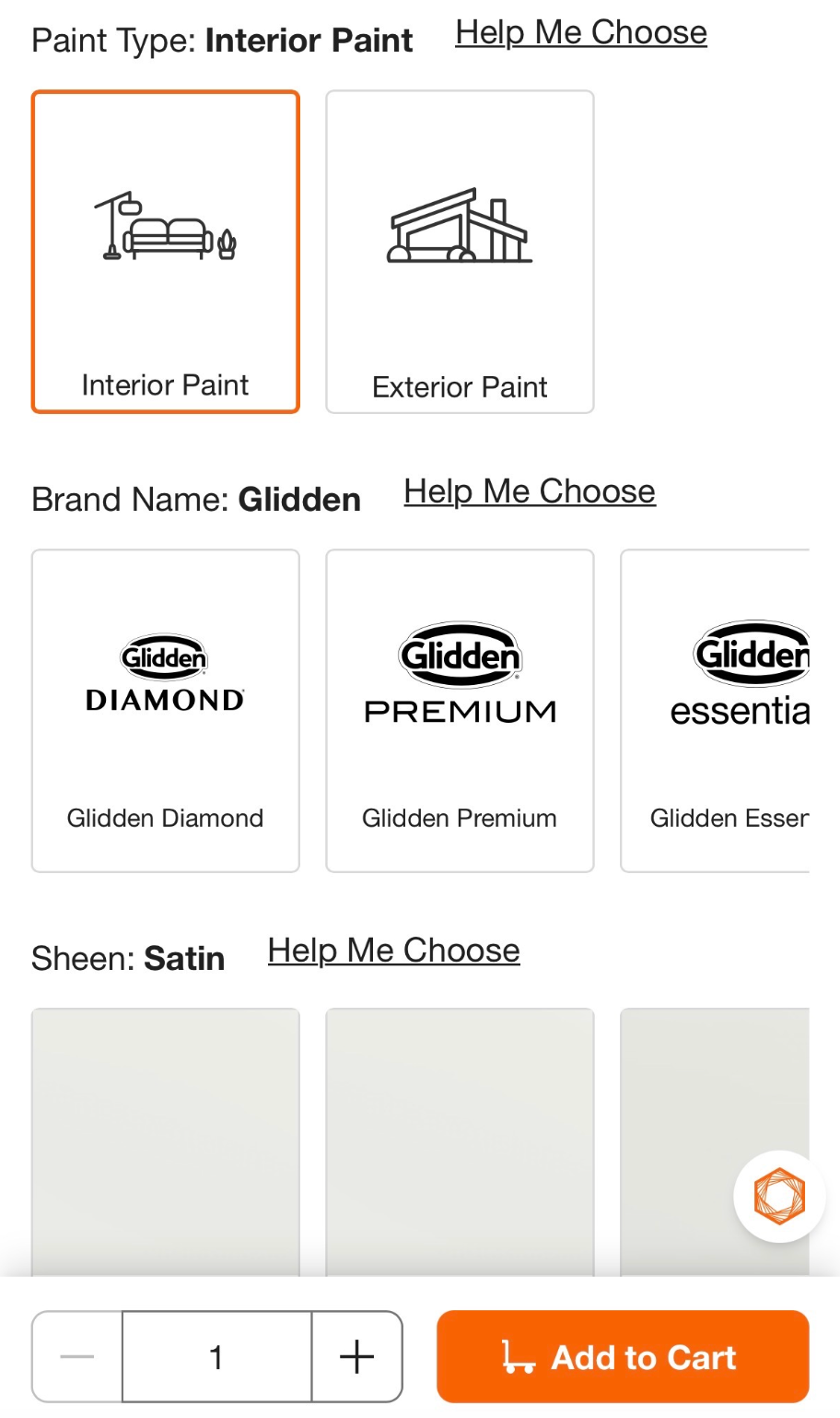
Sheen and container size selectors simplified to dropdowns
Design Work
From color discovery to the product page
Eight screens across three flows — the guided color explorer, the room-based compare tool, and the redesigned product detail page. Each step was designed to move customers closer to a confident purchase.
A guided flow that narrows 2,496 options to the right one
The original explorer dropped customers into an undifferentiated grid. The redesign introduced a 3-step guided flow: pick a color family, narrow by shade, then select a specific color. Each step reduced the decision space — and the anxiety that came with it.
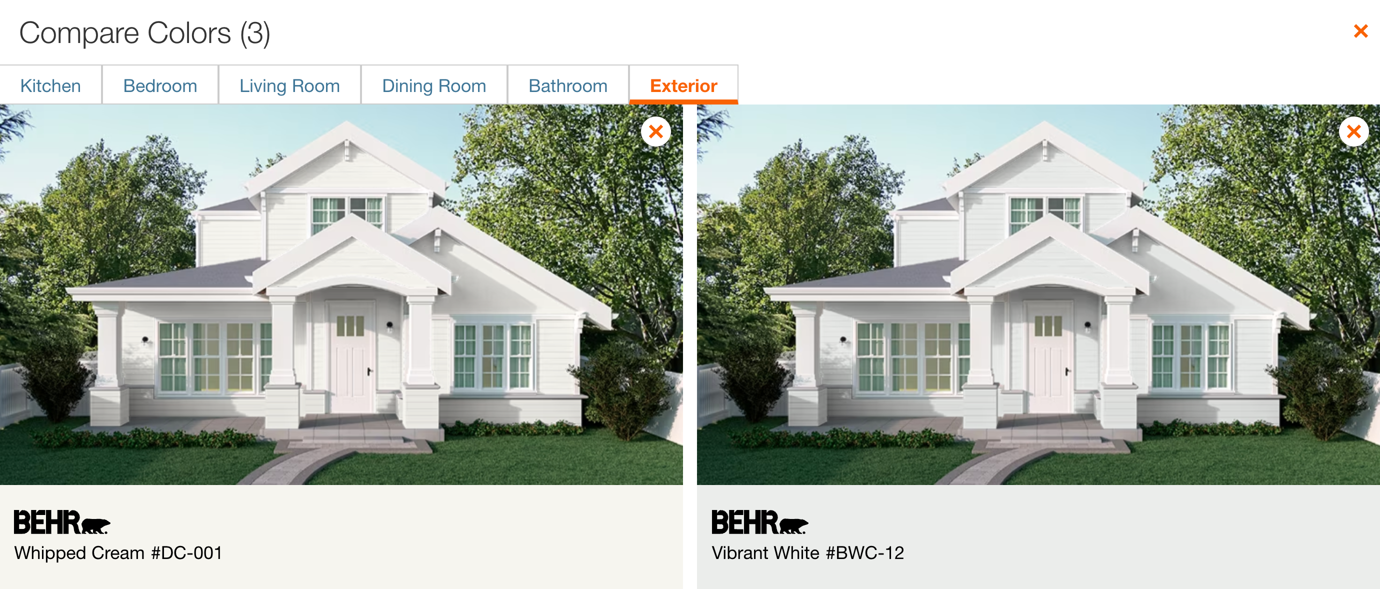
See two colors in the same room — exterior, bathroom, kitchen
The compare tool was rebuilt as a first-class feature. Customers could hold up to three colors side-by-side in six room types — and switch rooms with a single tap. The exterior view was the most-used: customers painting the outside of their house had the highest anxiety and the highest return rate.
Mobile designs
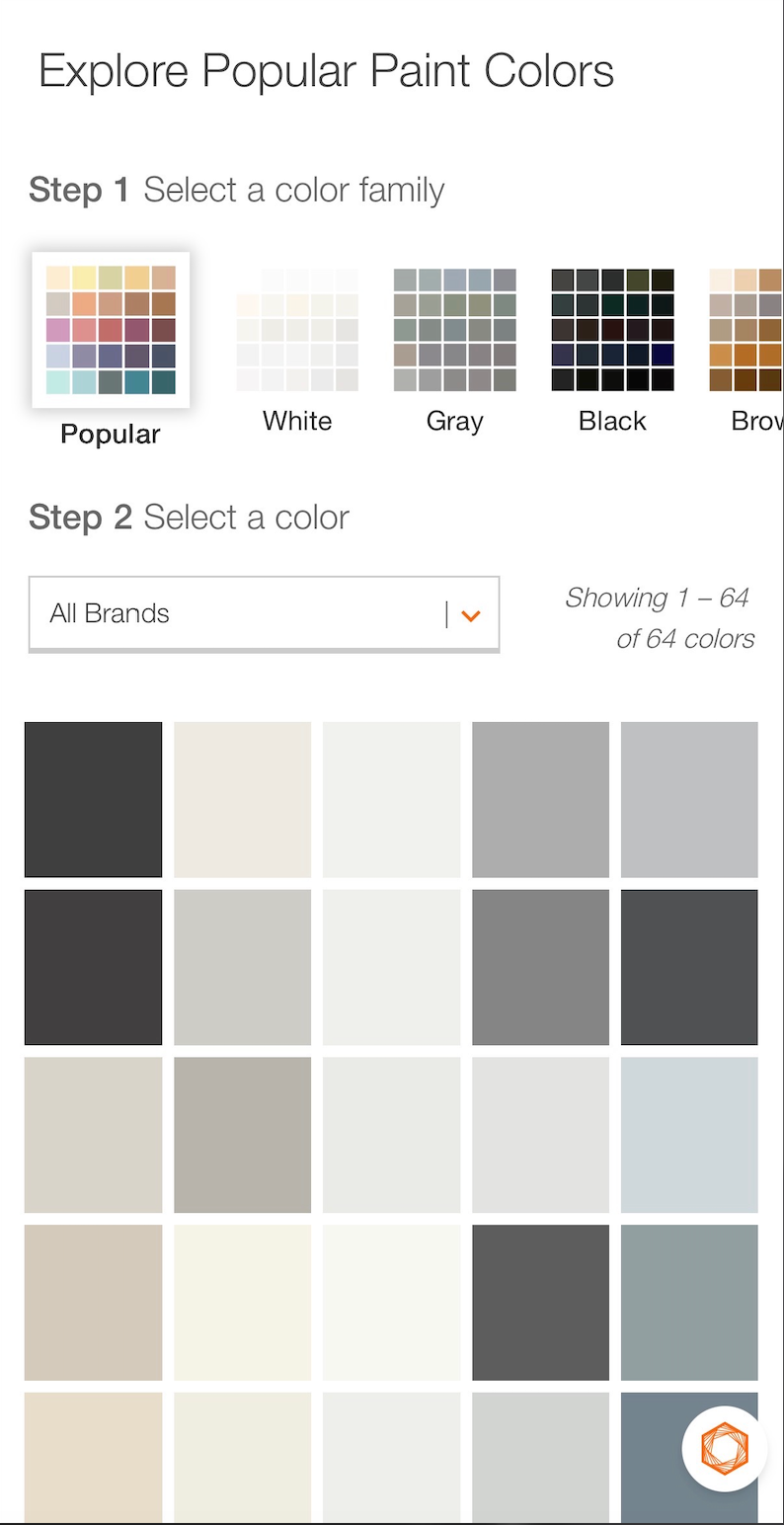
Three screens that turn a browser into a buyer
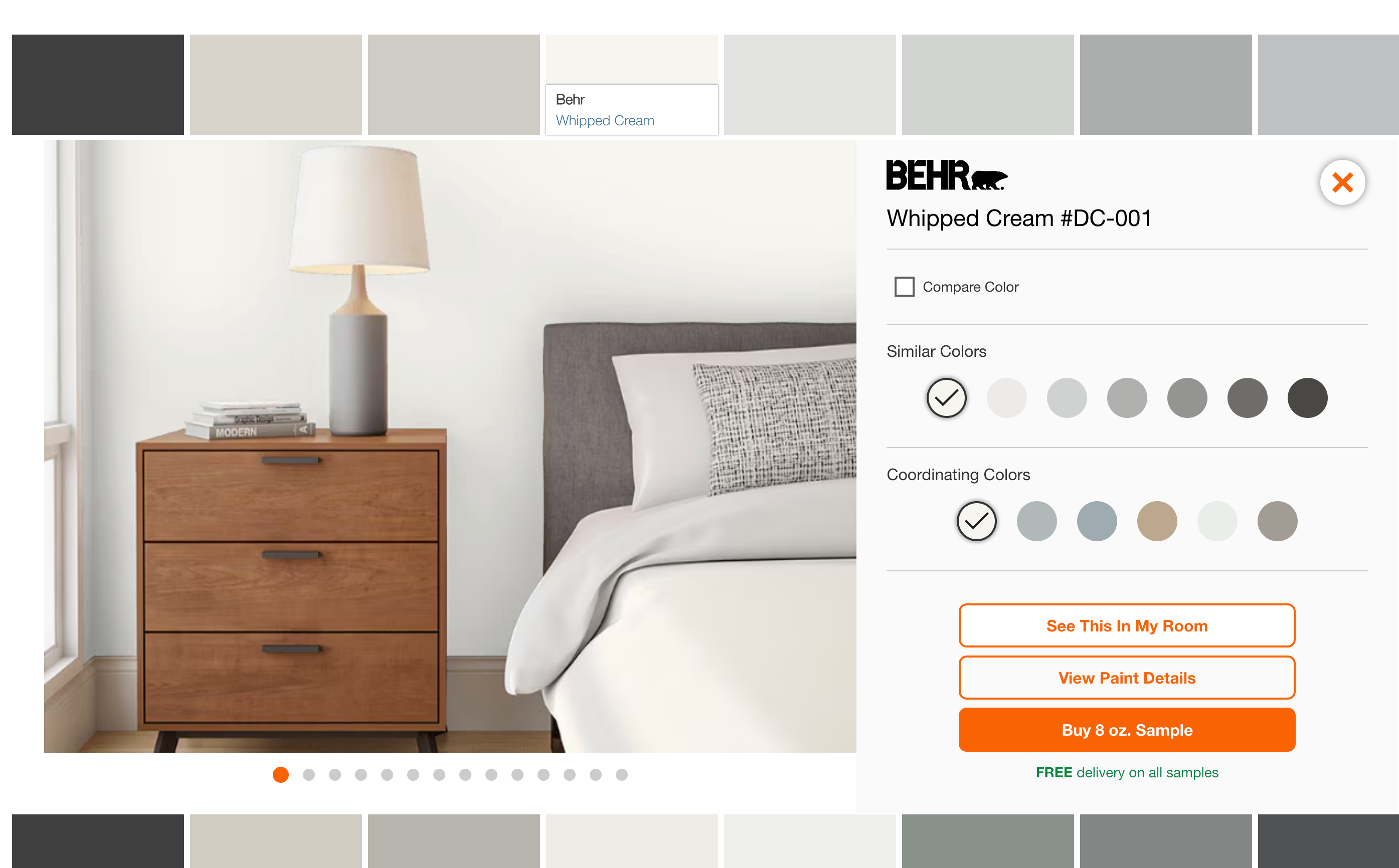
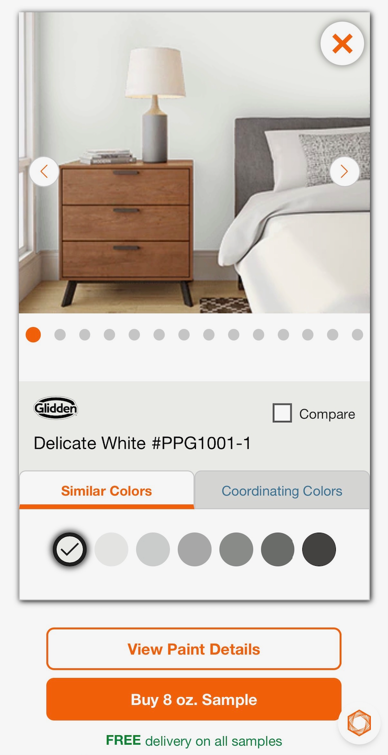
The PDP redesign had three parts: a color detail panel with room visualization and coordinating colors, a visual selector for paint type, brand, sheen, and container size, and the product listing page with the sample CTA promoted above the fold.
Sample CTA above the fold — primary action, not secondary
Visual icon tiles replace text dropdowns for paint type, brand, sheen, and container size
Room visualization and coordinating colors on the color detail panel
Similar colors row reduces the "is this the right shade?" anxiety
Specifications moved below the fold for power users
Key design decisions
What drove these choices
Sample as the primary CTA
User research showed that customers who ordered a sample converted to a gallon purchase at 4x the rate of those who didn't. Making the sample the primary CTA — not a secondary link — was the single highest-impact change on the PDP.
Room visualization over swatches
A/B testing showed that customers who saw a color in a room context were 2.8x more likely to add to cart than those who only saw the swatch. The visualization was the conversion driver.
Guided steps over open exploration
The original color explorer let customers jump anywhere. Testing showed this caused paralysis. A linear 3-step flow reduced time-to-decision by 40% and increased sample orders by 22%.
Outcomes
Customers who could see their space bought with confidence
What I learned
Anxiety is the real conversion blocker
Paint returns weren't a logistics problem — they were a confidence problem. Every design decision that reduced anxiety moved the conversion needle more than any UI polish.
The $3 sample is a trust mechanism
The sample wasn't just a lower-commitment purchase — it was a promise that the company stood behind the color. Promoting it as the primary CTA changed the emotional register of the entire PDP.
Guided flows beat open exploration at scale
With 2,496 white paint options alone, open exploration was paralyzing. A guided flow that narrowed the decision space consistently outperformed the show-everything approach.
Want the full deck?
Case study available on request
The full case study includes annotated wireframes, research findings, A/B test results, and the complete before/after flow documentation. Request it directly.